Modules
ANDI splits accessibility testing into manageable subtasks. For example: start by testing focusable elements, then image alt text, then check the color contrast, and so on. By selecting a "module" from the module selection dropdown, a user can test many areas of accessibility.
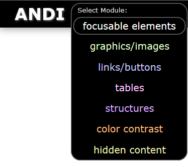
| Module Name | Area of Accessibility | Features |
|---|---|---|
| ANDI | focusable elements (default) | Interactive elements, tab order, accesskeys |
gANDI |
graphics/images | Alternative text |
lANDI |
links/buttons | Link comparison, button comparison |
tANDI |
tables | Data tables, cell associations |
sANDI |
structures | Headings, semantic HTML, ARIA roles, language |
cANDI |
color contrast | Automated color contrast checker |
hANDI |
hidden content | Revealing hidden content |
iANDI |
iframes | Iframe Content Testing |
When a module is selected it will re-scan the page and present results depending on the module selected. Read on for details about each module.
ANDI (focusable elements)

When ANDI is first launched, it always defaults to focusable elements (interactive elements). It checks for conditions that may cause accessibility issues related to focusable elements. ANDI (focusable elements) offers the ability to see the keyboard tab order indicators. It will also present a list of accesskeys found.
Accesskey List

If ANDI finds an element with an accesskey attribute on the page,
it will display the value in the Accesskey List.
The characters in the Accesskey List are links. When selected, the link will move focus to the element associated with the accesskey.
Note: ANDI will not be able to detect shortcut keys implemented using javascript (key press events).
Tab Order Indicators

When the Tab Order button is pressed, tab order indicator flags will be overlayed throughout the page next to each tabbable element. The flags contain a sequential number indicating the "flow" of the tab sequence. When the Tab Order button is pressed again, it will remove the tab order indicator flags.

If an element has been taken out of the tab order (tabindex="-1"), the flag will be red with an "X". If an element has a tabindex greater than zero, the background color of the flag will be orange. All flags have tooltips that provide these additional details in text form.
Title Attributes Button

When the Title Attributes button is pressed, any focusable element that has a title attribute will have the the title's value overlayed on the screen.

When the button is pressed again, it will remove the title overlay flags.
Label Tags Button

When the Label Tags button is pressed, overlays will be added next to each
<label> element.
If a label has a for attribute, then the value will be displayed.
Futhermore, if an id cannot be found that matches the label's for attribute,
then the overlay flag will be colored red and a tooltip will provide the message "no matching id".

When the button is pressed again, it will remove the label overlay flags.
tANDI (tables)

The tables ANDI (tANDI) module provides the ability to
inspect tables for column headers and cell associations. It checks for conditions that may cause accessibility issues related to tables.
When tANDI is launched,
it will analyze the first table on the page. It displays the size (columns by rows), the cell count.

Unlike other ANDI modules, tANDI analyzes only one table at a time.
Because of the one-table-at-a-time approach, all alerts in the
Accessibility Alerts list
refer only to the current table being inspected.
To analyze additional tables on the page, press the "next table" button.
Table List
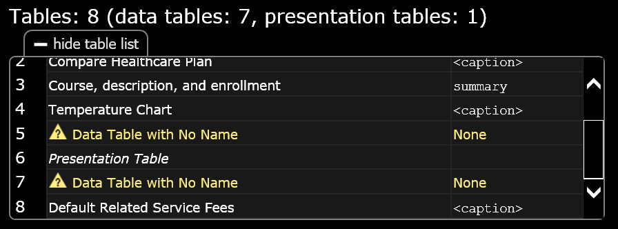
The table list will include a list of all tables on the page. Selecting a table in the list, will cause that table to be analyzed. For each table in the list:
- If the table has
role="presentation"orrole="none", "Presentation table" will be displayed. - If the table has an accessible name, it will be displayed.
- If the table has no accessible name but the element preceeding the table is a heading element, "Data Table with No Name, but Preceded by Heading: {heading innertext}" will be displayed.
- If the table has no accessible name, "Data table with No Name" will be displayed.
Previous Table / Next Table Buttons

If there are more than one table on the page, the "prev table" and "next table" buttons will appear.
Pressing these buttons will allow the user to analyze the "next" or "previous" table.
Remember, tANDI analyzes one table at a time so be sure to use these buttons
to test all tables on the page.
These buttons are not to be confused with the common previous element / next element buttons which shift focus between the table cells.
Table Cell Highlights
When tANDI is launched,
data table cells are given borders. When the cells are inspected,
background shading will appear for associated cells.
Borders
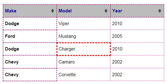
<th> cells will be given a darker, 2 pixel dashed border
and <td> cells, a lighter, 1 pixel dashed border.
Any cells or tables with danger level alerts will have a red border and the alert message
will appear in the Output.
Shading
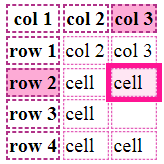
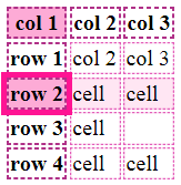
As a user hovers over a table cell or uses the Next/Previous Element buttons,
tANDI will highlight
associated cells.
This highlighting is based on the Table Analysis Mode selected.
Associating <th> cells will have darker shading and
<td> cells will have a lighter shading.
Header Cells Text
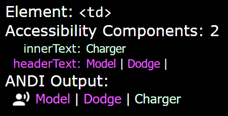
While inspecting data table cells, the ANDI Output will include text from associated header cells (depending on the Table Analysis Mode selected). The ANDI Output should be equivalent to what a screen reader would speak in its table navigation mode. Users should ensure that the Output is complete and accurate for each table cell.
Markup Button

When the Markup button is pressed it will overlay the table association markup
(th/td, scope, headers, id) for the current table being inspected.
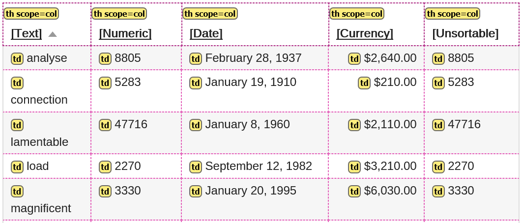
Pressing the button again will remove the markup overlay.
Table Analysis Mode buttons (scope or headers/id)


If tANDI
has detected the use of headers attributes on the table being inspected,
the table analysis mode buttons "scope mode" and "headers/id mode" will appear.
These toggle buttons control tANDI's analysis algorithm which
calculates cell-header associations based on
the Scope Method or the Headers/id Method.
tANDI defaults to "scope mode" when
headers attributes are not present.
lANDI (links/buttons)

The links/buttons ANDI (lANDI) module provides the ability to
inspect "clickable" links and buttons for uniqueness, completeness, and accuracy.
lANDI detects
potential accessibility issues with links such as
non-distinguishable or ambiguous links, the presence and functionality of internal or within-page "skip links",
and links with a missing or non-descriptive accessible name/description.
lANDI also detects
potential accessibility issues with buttons such as the automatic detection of non-unique buttons.
Links (mode)

This button will appear when lANDI detects
links that have an href on the page (<a href="url.html">).
When this mode is engaged, all visible links receive blue highlights.
Ambiguous Links Button

If lANDI has detected ambiguous links on the page,
the Ambiguous Links button will appear. When this button is pressed it highlights all ambiguous links on the page
with a solid blue border and shadow.
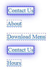
An ambiguous link means that another link exists on the page with an identical name/description
but each link points to a different destination (the hrefs are different).
See the Ambiguous Link alert details for reasons why this is an accessibility concern.
View Links List Button

When this button is pressed, it hides the Accessibility Alert List and display a list of every link on the page. The list will contain alerts, the accessible name & description of the link, and the href.
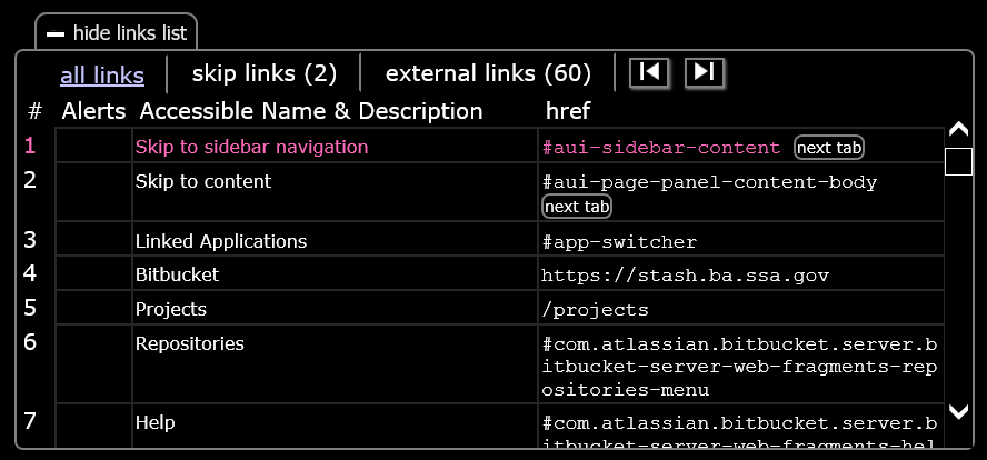
| # | The "index" number of the link. i.e. the order in which the link sequentially occurs in the code. |
|---|---|
| Alerts | If the link has a link-related alert, an Alert icon. |
| Accessible Name & Description | The accessible name and accessible description. |
| href |
The href value of the link.
Internal links (href="#...") will shift focus.
Javascript links (href="javascript:...()"): do nothing.
All others open a new window (or tab) at the location of the href.
|
| All Links Tab | Display all links in the links list. |
|---|---|
| Skip Links Tab | Filter only internal/skip links to appear in the list. |
| External Links Tab | Filter only external links to appear in the list. |
Buttons (mode)

<button><input type="button"><input type="submit"><input type="reset"><input type="image">- an element with
role="button"
When this mode is engaged, all visible buttons on the page will receive highlights.
Non-Unique Buttons Button

If lANDI has detected non-unique buttons on the page,
the Non-Unique Buttons button will appear. When this button is pressed it will highlight all non-unique buttons on the page
with a solid blue border and shadow.
An non-unique button means that another button exists on the page with an identical name/description. See the Non-Unique Button alert details for reasons why this is an accessibility concern.
View Buttons List Button

When this button is pressed, it hides the Accessibility Alert List and display a list of every button on the page. The list will contain alerts and the accessible name & description of the button.
| # | The "index" number of the button. i.e. the order in which the button sequentially occurs in the code. |
|---|---|
| Alerts | If the button has a button-related alert, an Alert icon. |
| Accessible Name & Description | The accessible name and description. |
| Accesskey | If the button has an accesskey attribute, the value. |
gANDI (graphics/images)

The graphics ANDI (gANDI) module provides the ability to
test the accessibility of graphics/images including the presence of alternative text.
When gANDI is launched
it displays the number of images found, including inline, background, and image links.
It also reveals any accessibility alerts associated with images.
gANDI provides the ability to toggle the appearance of the images
for enhanced visual detection and screen shot capturing purposes.
In addition to common alerts, gANDI will scan for
accessibility issues relating to graphics/images such as
<marquee>, <blink>, alt text containing file names,
redundant phrases in alt text ("image of", "photo of", etc.),
non-descriptive alt text ("image", "photo", etc.), and presence of server-side image maps.
Hide Inline (Images) Button

The Hide Inline button helps a visual user detect which images are inline (in the foreground).
When this button is pressed it will "fade" inline images
(<img>, <input type='image'>, [role=img])
from the page.
This is accomplished by dropping the image's opacity to 30%.
Pressing the button again restores the inline images to the original opacity.
When testing for accessibility, a gANDI user should
inspect every non-decorative inline image, read the ANDI Output which should contain
a meaningful description of the image.
Decorative Inline (Images) Button

The Decorative Inline button helps a visual user detect which <img>
elements have been programmatically declared decorative by the web author.
When this button is pressed, it adds a dark green glowing border around <img> elements
with any of the following markup:
alt=""oralt=" "role="presentation"orrole="none"aria-hidden="true"
Pressing the button again removes the border.
When testing for accessibility, a gANDI user should
ensure that every inline image declared as decorative is truly decorative
and does not need an additional description or explanation.
Hide Background (Images) Button

The Hide Background button helps a visual user detect background images.
When this button is pressed it will remove background images from the page
(CSS property background-image contains a url).
Pressing the button again reloads the background images.
When testing for accessibility, a gANDI user should
ensure that background images are truly decorative.
If not, a text alternative description of the background image must appear somewhere on the page.
Find Background (Images) Button
The Find Background button helps a visual user detect images coded as background images
(CSS property background-image contains a url).
When this button is pressed it adds a glowing green border
around every element that contains a background image.
Pressing the button again removes background image highlights.
When testing for accessibility, a gANDI user should
ensure that background images are truly decorative (not informative).
If not, a text alternative description of the background image must appear somewhere on the page.
Font Icons Button
The Font Icons button detects graphics that use the font icon technique.
When this button is pressed it adds a glowing green border
around every font icon element found that does not have
[role=img].
Pressing the button again removes font icon highlights.
A Font icon is a technique used to place an icon on the page using a font-family instead of an
<img> tag or CSS background image.
gANDI will check for the following types of font icons:
- Google Material Icons
class="material-icons" - Font Awesome
class="fa" - Glyphicons
class="glyphicon" data-iconattribute
sANDI (structures)

The structures ANDI (sANDI) module provides the ability to
test for the presence of semantic tags and ARIA roles associated with page structure.
When sANDI is launched
it displays three buttons: headings, lists, landmarks.
The buttons contain the total number of their respective structures.
For example: 3 headings, 2 lists, 0 landmarks.
Pressing one of the buttons, toggles sANDI into that respective mode.
While one mode is engaged, the other modes will be disengaged.
Headings (mode)

Pressing the Headings Button will engage Headings mode, and disengage the other modes.
Headings are an important part of page structure because they provide the topic of the sections on a page. Assitive technologies often provide a mechanism to quickly jump from heading to heading in a manner similar to how the human eye allows a sighted user to quickly scan for the major headings on a page.
In this mode, sANDI will find and highlight heading tags
(<h1>, <h2>, <h3>, <h4>, <h5>, <h6>)
as well as any element that has been defined as a heading using ARIA attributes
(role="heading" with aria-level)
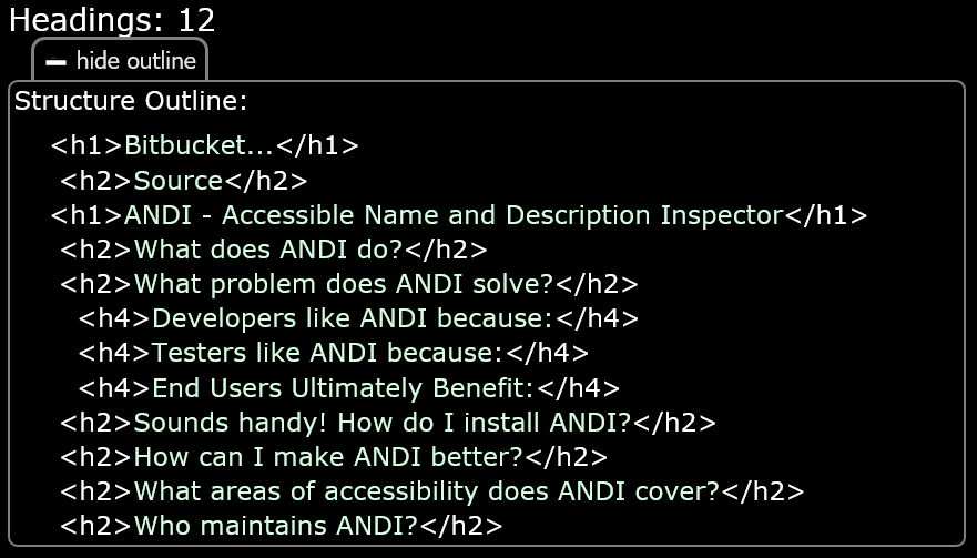
Pressing the View Headings List button displays a list of all headings ordered by the sequence in which they occur in the code. The order displayed in the list should match the order in which they appear in a headings list provided by assitive technologies.
Lists (mode)

Pressing the Lists Button will engage Lists mode, and disengage the other modes.
Lists are a common way to handle the grouping of common items. When the user of a webpage wants to look for navigation or other items that may be in list form, sighted users use their eyes to scan for the presence of a list and can begin reading. As an alternative for users who are visually impaired, assitive technologies often provide a mechanism to quickly jump to and through lists on the page.
In this mode, sANDI will find and highlight all list types
(<ul>, <ol>, <dl>)
and list items
(<li>, <dt>, <dd>)
Landmarks (mode)

Pressing the Landmarks Button will engage Landmarks mode, and disengage the other modes.
Certain HTML tags and attributes exist to provide semantics to the structure of a web page. These semantic structures (navigation, main, form, etc.) are referred to as landmarks. While programmatically hidden from visual users, assitive technologies often provide a mechanism for users to scan the page for landmarks to improve the efficiency of page navigation in a manner similar to a sighted user moving their eyes to different areas of the page.
In this mode, sANDI will find and highlight all landmark tags
(<main>, <header>, <footer>, <nav>, <form>, <aside>)
as well as any element that has been declared as a landmark using ARIA attributes
(role="banner", role="complementary", role="contentinfo", role="form", role="main", role="navigation", role="search", role="application")
Live Regions (mode)

Pressing the Live Regions Button will engage Live Regions mode, and disengage the other modes.
Live regions are areas of a page that a screen reader monitors for content changes. When the live region's content changes, the screen reader will read the new content. These regions are useful for notifications, status messages, and alerts.
In this mode, sANDI will find and highlight all live regions.
Live regions contain one or more of the following attribute/values:
role="alert", role="status", aria-live="polite", aria-live="assertive".
Reading Order
When the the Reading Order Button is pressed, numerical indicator flags are overlayed throughout the page next to each block of text. The flags contain a sequential number indicating the order in which a screen reader will read the blocks of text. The sequence numbering is based on the text's location in the HTML source code.
If an element has been hidden from a screen reader
using aria-hidden="true",
but remains visible to sighted users
the flag will be red with an "X" indicating that the element
is not included in the reading order.
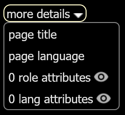
more details dropdown
page title
This button provides a popup that contains the Page title (from the <title> tag).
page language
This button provides a popup that contains
the defined language of the page (the lang attribute from the <html> element).
role attributes
This button adds an overlay flag near any element with a role attribute.
lang attributes
This button adds an overlay flag near any element with a lang attribute.
This is useful for a "language of parts" test:
Passages of text in other languages need the lang attribute defined
so that screen readers are aware of what language the words should be pronounced.
Use the "page language" button to check the entire page's language.
cANDI (color contrast)
The color contrast ANDI (cANDI) module
automatically detects accessibility issues relating to color contrast.
When cANDI is launched
it searches for HTML elements that contain text and grabs the text color and the background color.
These two color values are used to calculate the contrast ratio.
If the contrast ratio does not meet the minimum requirement for accessibility, the user will be alerted.
When a text-containing element is inspected
cANDI will display the Element tag name, the calculated Contrast Ratio, the Style, and any Alerts.
Contrast Ratio


The Contrast Ratio section displays the calculated contrast ratio, the Pass/Fail status, and the minimum required contrast ratio (Min Req).
The Min Req is calculated using the text color and background color, the font-size, and the font weight. For additional information on contrast ratio requirements refer to the WCAG Contrast Guidelines.
- PASS
- Elements that have a contrast ratio greater than or equal to the minimum required contrast ratio pass the contrast test and are accessible.
- FAIL
- Elements that have a contrast ratio less than the minimum required contrast ratio fail the contrast test and are not accessible.
- MANUAL TEST NEEDED
- Elements that contain a background image or gradient require a manual contrast test since the contrast cannot be determined using programmatic DOM (Document Object Model) analysis.
Minimum Required Contrast Ratio (Min Req)
As a minimum, WCAG recommends that text should have a contrast ratio of 4.5:1. For large text, the minimum ratio is relaxed to 3:1. (WCAG defines large text as font-sizes of 18pt or 14pt bold). A higher contrast ratio allows for more readable text. For example, black text on a white background produces the maximum contrast at a ratio of 21:1.
Precision
cANDI calculates the contrast ratio
to a precision of two decimal places.
Therefore, a 4.49:1 would fail a minimum contrast requirement of 4.5:1.
Similarly, a 2.99:1 would fail a minimum contrast requirement of 3:1.
Style

The Style section lists the following:
- Text Color:
- The color of the text (CSS
colorproperty) - displayed as a sample color box and hex value. - Background:
- Starting at the element, the element's ancestor tree is traversed until it finds either:
a background image or gradient (CSSbackground-imageproperty),
or the color of the background (CSSbackground-colorproperty) - displayed as a sample color box and hex value. - Font:
- The font size (CSS
font-sizeproperty) - always converted to pt units.
Optionally, the font weight (CSS font-size property) if bold (700 or greater). - Suggested Color:
- If the contrast ratio does not meet the minimum requirement, and there is no semi-transparency involved
cANDI will suggest color that could be applied to satisfy the minimum contrast ratio requirement - displayed as a sample color box and hex value. - Text-Shadow:
- The text shadow (CSS
text-shadowproperty) if it was defined.
Manual Contrast Test

When cANDI cannot automatically calculate the contrast, testers will need to perform
a manual color contrast test. This is done using an additional tool
that includes a color selector (eye dropper) to select a pixel from the text
and a pixel from the background. Most tools used for this purpose do the contrast calculation after the two colors are selected.
One such tool (free and available for download)
is the Colour Contrast Analyser.
Contrast Playground
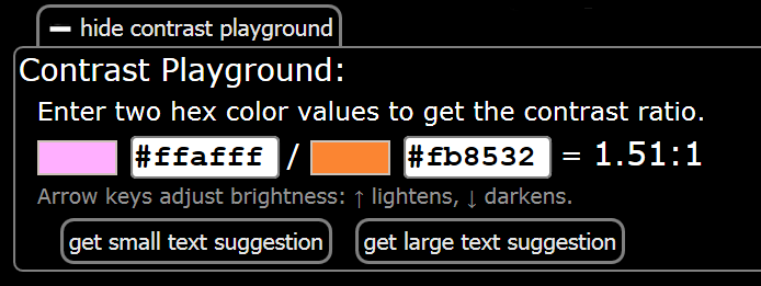
The Contrast Playground can be used to adjust two color values and have the contrast ratio automatically calculated. To show the Contrast Playground, press the "show contrast playground" button.
When the contrast ratio is below 4.5:1 the "get 4.5:1 suggestion" button will appear. Similarly, when the contrast ratio is below 3:1 the "get 3:1 suggestion" button will appear. Pressing either of these buttons adjusts the color values so that the minimum required ratio is met.
When focus is on either of the color value entry boxes, pressing the keyboard arrow keys up or down will adjust the brightness of the color. Up lightens, down darkens. Doing so immediately recalculates the contrast ratio.
Grayscale

This button transforms the test page into grayscale (black and white) viewing mode. This feature is useful to determine where meaningful color may be used. NOTE: The grayscale button will not appear in Internet Explorer.
IE Compatability Modes
Pages running in Internet Explorer Compatability modes (IE8 or earlier) cannot be tested with cANDI.
hANDI (hidden content)
The hidden content ANDI (hANDI) module provides the ability to
discover the presence of hidden content that should be tested for accessibility.
The purpose of hANDI is to expediate the discovery process
by notifying a tester that hidden content exists on the page.
A tester should then find the triggers or processes that "naturally" cause the hidden content to appear,
since testing content that is forced to be revealed is not reliable and not part of the natural "flow" of the page.
To enforce this practice, any content revealed by hANDI
will be "unrevealed" when launching another ANDI module.
When hANDI is launched
it will detect common CSS hiding techniques used and provide buttons which provide the ability to
toggle the CSS and thus reveal the hidden content.
All revealed content will be given a glowing yellow border. Since the content was forced to appear, it will most likely cause unusual display or alignment issues on the test page.
Reveal All Button

Pressing the Reveal All Button will reveal all content hidden using the techniques which
hANDI has detected.
CSS Hiding Techniques Dropdown
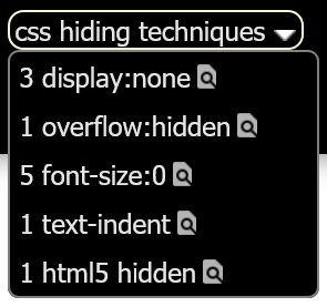
This dropdown contains other buttons which will toggle the display of elements being hidden using a particular technique. Sometimes, an element may have more than one hiding technique applied and may need more than one of the buttons to be engaged to get the content to appear.
Options that may appear within this dropdown are:
- display:none
- visibility:hidden
- position:absolute
- opacity:0
- overflow:hidden
- font-size:0
- text-indent
- text-indent
- html5 hidden
position:absolute
For an element to be hidden off screen using CSS position:absolute, it must also have an extreme
left, right, top, bottom value assigned.
hANDI only reveals absolute positioned elements that are off screen.
Elements visually hidden with this technique, are usually available to a screen reader.
html5 hidden
Introduced in HTML5, the global hidden attribute allows a developer to hide anything.
Some browsers render these elements as CSS display:none. Therefore,
to reveal these elements, a hANDI user may have to also press the
"display:none" button.
Screen readers will not be able to read elements visually hidden with this technique.
text-indent
This hiding technique uses a CSS text-indent with a large negative value.
Only negative values less than -998 will be recognized as hidden by hANDI.
Elements visually hidden with this technique are usually available to a screen reader.
Content ::before ::after Button

This button will appear when text content has been injected using the CSS
pseudo-elements ::before or ::after.
Depending on the browser, text injected using this technique may not available to
screen readers, therefore, an alert will be thrown when this technique is detected.
When this button is pressed, the injected CSS text content will be highlighted on the screen.
iANDI (iframes)

The iframes ANDI (iANDI) module allows users to
test the contents of iframes for accessibility.
NOTE: Iframes need to be tested independently in a new window because browsers do not allow
javascript/CSS manipulation of iframes in an effort to prevent security vulnerabilities.
iFrame List
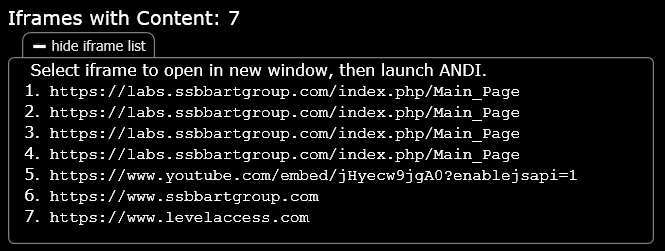
Pressing the "View Iframe List" button expands the iFrame list. Selecting a link in the iFrame list opens the iFrame independently in a new window. Pressing the "Hide Iframe List" button will collapse the iFrame list.
Test In New Tab Button

Pressing the Test In New Tab Button opens the iFrame independently in a new tab. Testers can then launch ANDI to test the iFrame.
NOTE: Depending on how the iframe is built, this feature may not work as expected.